Rescue Beauty Lounge Locavore”: The Rundown

Bling, bling, Locavore’s the thing!!

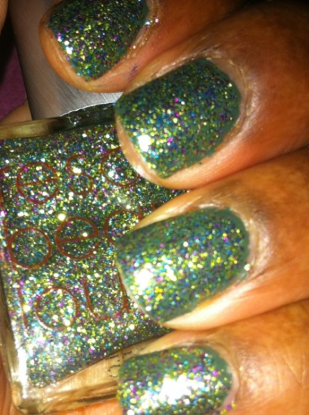
Absolutely jam-packed with uniform glitter in light green, dark green and purple, it’s no wonder Locavore took the top spot in the Rescue Beauty Lounge BIB2 round of voting.  The predominance of glittery green appeals to the die-hard Tinker Bell fan in me and I could totally see her rocking this color.

20111209-214947.jpg

Locavore by Rescue Beauty Lounge. So glittery a tinker fairy would be lemming for it!

The glitter brushes on evenly (no ‘push and place’ as with some other glitter polishes) and you can get a pretty nice opacity in two to three coats.  The glitter is very finely milled so when it dries the glitter is barely felt when you touch it.  My favorite use of this polish is to put it over either a dark green or purple polish like Orbis Non Sufficit or Mismas.

20111209-215104.jpg

RBL Locavore on bare nails. 2 coats w/ flash

As with all RBL polishes I own so far, I get a little over a week of wear with this and only minimal tip wear. As I work in IT I type a LOT (over 120wpm) so while I do expect my nail polish to wear at the tips, shattering and sending dangerous shards of nail polish isn’t something that happens with RBL. In other words, no chipping. Cost per bottle is $18 and free domestic shipping is offered for orders over $100 ($200 for international orders) at RescueBeauty.com. Remember, Rescue Beauty Lounge nail polishes are 5-Free and Made in the USA.

So are you totally lemming for this? You should be. But don’t wait too long to purchase as these will only be available as supplies last.  Get it while you can at retail while you can because she who hesitates will wind up auction sniping.

20111209-215143.jpg

RBL Locavore over RBL Orbis Non Sufficit

20111209-215158.jpg

RBL Locavore over RBL Mismas--Mardis Gras anyone?

butterLONDON Spring 2012: The Rundown

Spring 2012 has indeed sprung for butterLONDON. Check out the display I saw at Ulta Beauty this past week:

20120220-202246.jpg

Butter London's Spring 2012 Polishes displayed at Ulta Beauty

butterLONDON’s Spring 2012 consist of the following shades (description from butterLONDON.com):

  • Disco Biscuit — Tropical hot pink with an undercurrent of tiny iridescent glitter particles.
  • Trout Pout — An opaque shade of cantaloupe, pale and retro.
  • Slapper — A truly teal lacquer, bold and very bright.
  • Bossy Boots — Light, opaque pistachio green. A beautiful take on neutral for this season.
  • Knackered — A sheer, twinkling oyster shade flecked with micro glitter particles.

I picked up Bossy Boots and Disco Biscuit because those colors personally appealed to me. I passed on Slapper as I already have Artful Dodger, Deborah Lippmann’s To The Beach and Sally Hansen’s Brisk Blue. Trout Pout is a color I think to be easily dupeable. Knackered almost got me to buy it but I’d already picked up Deborah Lippmann’s Mermaid’s Dream.

20120220-202722.jpg

Two of butterLONDON's Spring 2012 offerings: Bossy Boots and Disco Biscuit

Disco Biscuit is bright, pink and has glitter so I had to pick it up even though I wasn’t pleased with butterLONDON’s glitter polishes of late. It goes on sheer yet bright and takes about 3 coats to reach some opacity. And by some I mean I still had the dreaded VNL (Visible Nail Line) after all that. I honestly feel this color would work better over a bright white or pink cream polish first to solve the VNL problem but even by itself it is a fun color to wear. As pretty as it is, even with a base and top coat (butterLONDON’s Tops & Tails set) I had tip wear the first day and chipping the second day (more insight to follow at the end of this review).

Now you know me being the geek that I am I had to find out what Disco Biscuit meant, right? Turns out it’s something to keep you ‘dancing at the disco’. So this could range from a cup of Starbucks, a can of Red Bull or something to get you in hot water with local law enforcement and/or the DEA.

20120220-202457.jpg

Disco Biscuit by butterLONDON. 3 coats with flash.

Bossy Boots is a nice interpretation of a neutral color. Unfortunately it does remind me of the linoleum floor my Memaw had in her 1950’s style kitchen in North Florida. Still, the pastel looks very nice as a contrast against dark skin like mine though because it has more of a yellow undertone instead of blue, the color looks a bit washed out next to my skintone.  Regardless,  I got lots of compliments on the color. Most folks thought it was OPI and had never heard of butterLONDON until I informed them of it. It is lighter than Illamasqua’s Milf which is a deeper pastel green with blue undertones. While the first coat was streaky (a usual hazard with most cream polishes) and it took about 3 coats to make the finish look even. Another ding against the color is it started to chip after two days and chip like crazy it did.

20120220-202514.jpg

Bossy Boots by butterLONDON. 2 coats with flash.

So by now you probably think my opinion is that butterLONDON is a lousy polish. Nothing could be further from the truth. I am very, very, very hard on my nail polishes as I type over 120wpm (which causes crazy shear forces on the nail edge), am constantly typing all day (a hazard of working as an Software Engineer/Business Analyst), use a lot of hand sanitizer as I am a serious germaphobe, then add to that the usual daily hazards and my nail situation is, to put it in statistical terms, an outlier. I’m in the tail to the right of the bell curve. Because of my occupation and personal habits I need a nail polish that performs above and beyond the norm. butterLONDON polishes are very pretty, very trendy and have a great color assortment but the consistency across formulas is not there…yet. I love my frost finishes (Wallis and Fairy Lights wear like iron), have a love-hate relationship with the others (Artful Dodger, Tart With A Heart, Black Knight), and you will have to pry the gorgeous pearly blue-gray Lady Muck from my cold, undead fingers.

20120221-201115.jpg

I'm not a bug, I'm a feature! 🙂

The truth is, butterLONDON polishes need more work on the wear longevity across the range before I can recommend them against the likes of Illamasqua. Illamasqua is the same price (though not as widely available in brick and mortar locations) yet out of the 20+ polishes of theirs I own I have yet to run across one that chips as easily as my butterLONDON polishes I’ve indicated. And cheaper brands such as Sally Hansen and even the awesome indie brand Cult Nails have a longer wear time under my use conditions. So until the consistency improves (and I will continue to buy colors that appeal to me), I wil consider this line to be in ‘Beta’–which in software geek lexicon means the code is right but it’s not ready for use by the general public until the ‘bugs’ are worked out.

butterLONDON polishes retail for $14 USD and are available at Ulta Beauty boutiques and online store, SkinStore.com and Beauty.com. Skin Store has a lot of 20% off sales so definitely check that site out first for butterLONDON polishes to see if they have the color that sparks your interest.

So what have your experiences with this polish line been?  Ping me in the comments!

20120220-202737.jpg

Bossy Boots by butterLONDON. Pretty but a very 'dupeable' color.

20120220-202748.jpg

Disco Biscuit by butterLONDON. A pretty tropical pink with sparkles.

Deborah Lippmann Spring 2012 Collection: The Rundown

I’ll admit I am a total sucker for blues. From bright blue to teal green there is something about the color that grabs me. Perhaps because I was born under a ‘water sign’ (Scorpios represent!) or because I am in total love with the bright blue waters of the Caribbean and the South Pacific. And obviously I wasn’t far off as Deborah Lippmann tells Lucky Magazine, “I wanted to create something that felt like a vacation no matter where you are—whether you’re actually going away or just dreaming of it.”

20120219-223737.jpg

Deborah Lippmann's gorgeous offerings for Spring 2012: Mermaid's Dream and At The Beach

Even though our winter here in the Philadelphia suburbs has been relatively mild, I’ve definitely been dreaming of a vacation somewhere warm. So when I saw these two polish up for pre-sale on NeimanMarcus.com I immediately pre-ordered and was overjoyed when they arrived ahead of the estimated delivery date.

Deborah Lippmann’s Spring 2012 offerings consist of two complimentary yet different shades: To The Beach and Mermaid’s Dream. To The Beach is a textbook cyan blue cream which Deborah describes as, “The French Riviera in a bottle’ . I think of it more as Tahiti in a bottle but French Rivera works for me too. It goes on the nails very smooth and the consistency is neither too thick nor too thin. It isn’t opaque in one coat (and looks a tad bit streaky) but becomes a nice opaque cyan in two coats with a smooth glass finish. I personally like three coats to punch up the color intensity. It is more blue than Illamasqua Muse and more cyan than Sally Hansen Instra-Dri Brisk Blue. Sally Hansen’s Brisk Blue is a very close color hack of To The Beach. And by very I mean down to the finish and the color. Illamasqua’s Muse is too dark of a teal to be a dupe.

20120219-224031.jpg

At The Beach: Described as 'French Rivera Blue' the Programmer in me sees it as 'Textbook Cyan' (2 coats w/ flash)

20120219-224231.jpg

From top: Sally Hansen Brisk Blue, Deborah Lippmann At The Beach, Illamasqua Muse (2 coats w/ flash)

20120219-224248.jpg

From top: Sally Hansen Brisk Blue, Deborah Lippmann At The Beach, Illamasqua Muse (no flash/HDR)

Mermaid’s Dream is a gorgeous seafoam green pearl with flecks of turqouise glitter and it is hands-down my favored polish of this collection. A glitter-on-pearl look I’ve done separaterly using Boom Boom Pow over Nefertiti but never before did Deborah have a bottle containing both in her polish line. According to Deborah, she likes this as a ‘accent-nail look’ to just wear on your ring finger while the other nails are painted bright blue. This would definitely be a cool look as coupled with To The Beach but personally I think this shade is just too different and glamorous to not have it on all of your nails. Opaque in one coat, this is a perfect ‘glam’ shade to wear for a night out, the prom, full glitz beauty pageants and my favorite, just swimming in the pool when wearing jewelry isn’t a practical option. I have nothing in my nail polish color collection that comes close to this shade. This makes it truly unique and the ‘must have’ from this collection.  I would put it up there with Chanel June as the must-have ‘on trend’ nail shade for Spring 2012.

20120219-224010.jpg

Mermaid's Dream: A glitter and pearl seafoam green polish--a first for Deborah Lippmann (2 coats w/ flash)

With both shades I had minimal tip wear and both shades wore for over a week through intense 120wpm typing/coding through an 8 – 10 hour work day. The performance is in line with the other Deborah Lippmann polishes I own.

Deborah Lippmann polishes retail for $16 on average with some variation according to finish.  At The Beach retails for $16 while Mermaid’s Dream retails for $18.  Both colors are available now at LippmannCollection.com, NeimanMarcus.com and coming soon at Beauty.com.

20120219-224311.jpg

Deborah Lippmann's Mermaid's Dream from Spring 2012 collection

20120219-224320.jpg

Deborah Lippmann's At The Beach from Spring 2012 collection

Essie Luxeffects: The Rundown

Essie Luxeffects are a series of high-shine & glitter topcoats. Usually glitter and sparkle aren’t something I think of when I hear Essie so I was anxious to try these out. At $8 a bottle they are definitely cheaper than the Deborah Lippmann glitter polishes I own so I figured why not try them out?

20111226-174455.jpg

The store display in Ulta. So shiny and pretty!

I skipped the gold colors as they were too ‘yellow’ and on my cool-toned skin they would look like poo. Instead I opted to purchase Set In Stones (varying sizes of round and hex silver glitter), A Cut Above (a warm pink variegated glitter) and Pure Pearlfection (a gorgeous white shimmer).

20111226-174521.jpg

From left: Pure Pearlfection, A Cut Above, Set In Stones

Unlike with my higher-end glitter polishes like Deborah Lippmann and Rescue Beauty Lounge, Both A Cut Above and Set In Stones have that annoying habit of the glitter not going on smoothly. You have to do some maneuvering of the glitter on the brush to get it to go and stay here you want it to go. It’s more of a brush and ‘push to position’ rather than one swipe and done so make sure your nail color is dry before putting on this glitter. Once it dries, the glitter looks very pretty and is very eye-catching.

For me personally, A Cut Above was too warm of a pink so no matter what I wore under it the glitter looked great but the color looked absolutely awful against my skin. Performance-wise I had no issues with it.

20111226-174605.jpg

Essie Luxefffects: A Cut Above over SpaRitual Lucy In The Sky With Diamonds.

Set In Stones didn’t have that problem as it is a very cool-toned flashy silver and looked great against my skin. The various shapes of glitter in this polish reminds me of Deborah Lippmann’s Today Was A Fairytale. I don’t own it myself but going by pictures I’ve seen it looks very familiar. The darker the base polish coat you use the more it pops out against it for a stunning effect. I used Esssie School of Hard Rocks (Winter 2011 collection), Trophy Wife and Dive Bar (permanent, Christmas 2011 repromote) as bases in the swatches below.

20111226-174719.jpg

Essie Luxeffects: A Cut Above over Trophy Wife

20111226-174816.jpg

Essie Luxeffects: A Cut Above over Sexy Divide (flash)

20111226-174839.jpg

Essie Luxeffects: A Cut Above over Sexy Divide (no flash)

20111226-174937.jpg

Essie Luxeffects: A Cut Above over Dive Bar (flash), my favorite!

Pure Pearlfection has to be my absolute favorite out of the entire collection. Best suited for use with light colors, Pure Pearlfection gives a ‘fresh fallen snow’ effect across the nail color. The closest thing to this that I own (but haven’t swatched as of yet) would be Deborah Lippman’s Bring On The Bling. I would definitely wear this in conservative office settings, and I also think it would look amazing on the nails of winter brides.

20111226-182920.jpg

Essie Luxeffects: Pure Pearlfection over butterLONDON's Lady Muck

20111226-182955.jpg

Essie Luxeffects: Pure Pearlfection over Cocktail Bling

20111226-183226.jpg

Essie Luxeffects: Pure Pearlfection over School of Hard Rocks

These are nice topcoats but they’ve been done before by various other nail polish companies. If I had to recommend one to purchase, it would be Pure Pearlfection. It is extremely versatile and well worth the price. When I first purchased these they were only available at Ulta. Now they are starting to show up in Target alongside of the Resort 2012 colors.

Lust Must: Juicy Couture iPhone Case

One look at this gorgeous piece of functional glam and you know it belongs in your stash.

I purchased this from the Juicy Couture website on Black Friday when I bought the Deborah Lippmann exclusive nail polish set. There is actually plastic casing over the glitter so its smooth to the touch and not gritty.

If you’re a glam geek girl or know one, this makes a perfect Christmas or Hannukah gift.

20111208-100225.jpg